BINDING THE SHADOWS cover
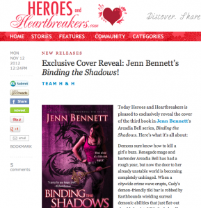
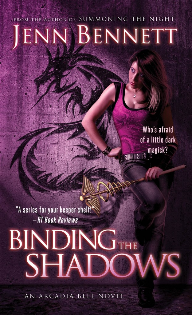
 In case you missed it, Heroes and Heartbreakers did an exclusive cover reveal for the next full-length Arcadia Bell book, BINDING THE SHADOWS (releases on May 28, 2013). Consensus so far is folks seem to dig it! I won’t lie: I LOVE IT. I think it’s the best Arcadia cover so far. Once again, the wonderful Tony Mauro did the artwork, and this Cady model is even closer to the Cady in my mind than the first two.
Lots to love about this one. First, Cady’s plumped up in the breast department—rawr! Second, the caduceus staff she’s holding EVEN HAS THE GRAPHITE PLUG AT THE END. Nice worldbuilding-accurate detail! Third, the creature on the wall is a BIG part of the plot for books #3 and #4. (And it’s a serpent, not a dragon.) Fourth, the color is gorgeous. Fun fact: purple is Jupe’s favorite color (mentioned at the very end of SUMMONING).
Here it is below. What do you think?


November 13, 2012 @ 6:34 AM
It looks great! May can’t come fast enough!
November 13, 2012 @ 10:11 AM
Aww, thanks! I’m super excited about the cover AND the contents of the book. Can’t wait for you to read! 🙂
November 13, 2012 @ 9:46 AM
Love the purple and the pose in this one. Great cover!
November 13, 2012 @ 10:12 AM
Thanks so much, Lee! I’m really happy with this one. 😀
November 13, 2012 @ 10:44 AM
OMG Its amazing! Tony Mauro does such awesome covers for you!
Love Cady! Seriously love all the shades of purple. (Jupe!) Love the serpent on the wall. Is that one on her shirt as well? Eek. I hope that doesn’t foreshadow Cady going dark. >-<
Wait, back up to the plumped up breasts being relevent to the book. You know this is going to lead to a string of rumors. lol
November 13, 2012 @ 11:13 AM
Aww, thanks, Marissa! I’m so, so happy with it! Nice catch on the shirt design: yep, serpent-y stuff going on there, too. No, it doesn’t foreshadow Cady going dark—just something she has to battle. Breasts: LOL! I was referring to a funny/awkward scene.
November 13, 2012 @ 11:58 AM
Wow, cleavage and smoky, dramatic eyes, dragons and worldbuilding specifics all plugged into one gorgeous cover. It’s awesome! But, um…no crimson lightning? I mean, don’t you feel that would add a certain, oh, je ne sais quoi to the whole ensemble?
🙂
November 13, 2012 @ 3:47 PM
Ha! I think my pub used up their crimson lightning resources in the novella cover. Crimson Lightning would be a good band name, though. 😉
Cover Art Coverage: 13 New Titles! | All Things Urban Fantasy - Where Para is Normal
November 14, 2012 @ 11:13 AM
[…] Source: Author’s Blog […]
January 17, 2013 @ 1:36 AM
I’m not sure how I missed this, but I love it as well, especially the colour and the depiction of Cady, which is pretty close to how I see her in my head. (Although in my head, occasionally she’s wearing the dreaded froufrou girly nightie that caused both Lon and myself much amusement.) Congratulations on scoring great covers, which seems like no mean feat these days! It makes me physically cringe when I see what some very talented authors get landed with. I can’t understand the decisions made by the art and marketing departments at times. I’m almost certain that faced with a gorgeous artsy cover or a dreadful 70s bodice-ripper style cover in a bookstore, most readers will be drawn to pick up the former. Nobody wants a book they’d be embarrassed to be seen reading on the bus or by their mother. One advantage to self-publishing, I suppose, when I get up the nerve! 🙂 Choose your own cover art.
Just pre-ordered this and can’t wait. Will hope to be able to read the novella soon, but actually just re-read the first two over the weekend and it’s a series that stands up extremely well to multiple reads, which I honestly can only say about a handful of the titles I’ve read in the past couple of years. They have a solid place on my extremely crowded keeper shelf. In between the complete set of Jeeves and Wooster and Stacia Kane’s Downside Ghosts series, so there’s some mixed company for you! 😀
January 18, 2013 @ 12:32 AM
Ha! So very glad you picture Cady in the cupcake nightie! She would be horrified, but that makes it all the more fun. And thanks for the cover love. I really do like it. My pub and I’ve talked about putting Lon on the cover with Cady a couple of times, so I often wonder how that would turn out. I’m told a male+female urban fantasy cover is difficult to market. But now that you mention the 70s bodice-ripper, I’m starting to picture Lon in a Fabio role. Shirt and hair fluttering in the wind, bare chest. Swinging on a rope with Cady in his arms. OOoooaf! It’s so bad, it hurts! Wait, how ’bout this: Cady as Fabio, rescuing Lon while wearing a side-split dress fluttering open around her thigh. URBAN FANTASY GOLD!
Shucks, thanks for re-reading. Very flattering! Now you’ll notice where Foxglove changed from chocolate lab to a black lab and other minor errors. Strangely, several readers have recently told me they’ve re-read the first two. (Downside Ghosts is an awesome, awesome series, btw.)
Lastly: LEASHING THE TEMPEST should be on its way to you by early next week at the absolute latest. Sorry for the holdup. The holidays were nuts, and dealing with two publishers/deadlines is a juggling act. But I’ve been gearing up to post all my backlogged mail in one fell swoop: there are piles of addressed mailers collecting in a box in my office as I type this, yours included! Thanks for being patient—as I see you are a writer yourself, then hopefully you’ll empathize with my disorganized writer brain. (P.S.: Lots of advantages to self-publishing. I’ve often considered testing the waters, myself. I say research your options, polish your stuff, and go for it!)
January 18, 2013 @ 1:18 AM
Oh, please, don’t apologise. I’m still incredibly grateful that you’re prepared to do that. I actually meant I hoped for your sake that the international rights get sorted soon (and for mine; I’ll likely buy a digital copy too).
And thank you – I have to admit my writing has suffered a bit from illness this year (when I’m miserable, I’m more likely to curl up and listen to Agatha Christie audiobooks on iTunes than try to write myself. There’s something vaguely comforting about murder mysteries when you don’t feel well: must be that “Well, it could be worse. I could be mysteriously stabbed to death on a snowbound train in Croatia” burst of optimism). The writing for my thesis tends to kill off any creative impulses too. Some of it is admittedly very interesting, but I spent three months in the last part of 2012 reading through ten years of management meeting minutes from the university libraries in the 1960s. It was exciting as it sounds. But I always come back to what I call the “fun” writing. 🙂 Saves my sanity at times, I think!
I feel slightly daunted at the thought of how Lon might be translated into cover art. 😀 The pirate mustache might morph into something worthy of either Poirot or a really bad adult film. Now that you mention it, you’re right, I hardly ever see the hero on the cover of UF novels, at least not in human form. Lots of wolves, beasts and lions hovering in the background. I suspect the art department might not be keen on transmutated Lon complete with horns (although I personally wouldn’t object to seeing that!).
And yes, the Downside Ghosts series is another favourite, although I’m always a bit apprehensive where the plot is going to go next. I’m a shameless Terrible fangirl (and he’s definitely a hero who might be better left to the reader’s imagination! I can see a cover artist taking the Elvis references and running to a very frightening place with them.)
January 19, 2013 @ 3:35 AM
Oh, no doubt: if they put Lon on the cover, it would be a disaster. Same with Terrible. I like him just fine as the supercool, swoon-worthy antihero I picture in my head.
Goddess Agatha is a cure for any ailment. And a thesis of any sort is no small feat—you have my pity and admiration! Hopefully 2013 will give you less illness and more free time to tackle the Fun Writing. 🙂